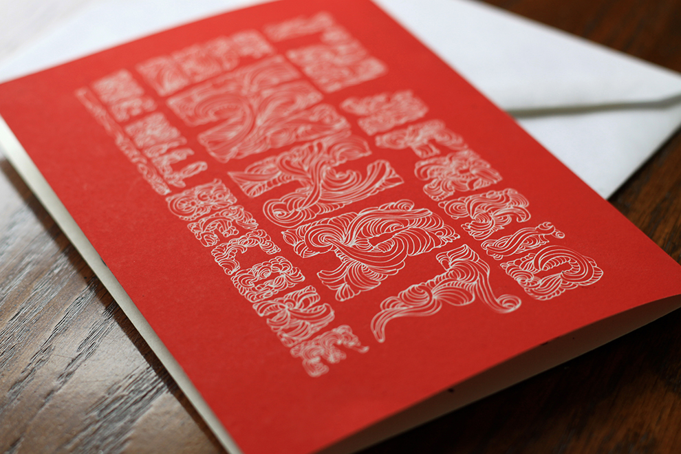
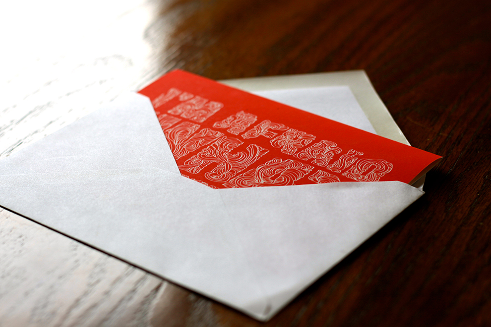
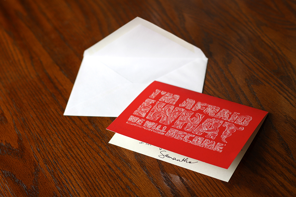
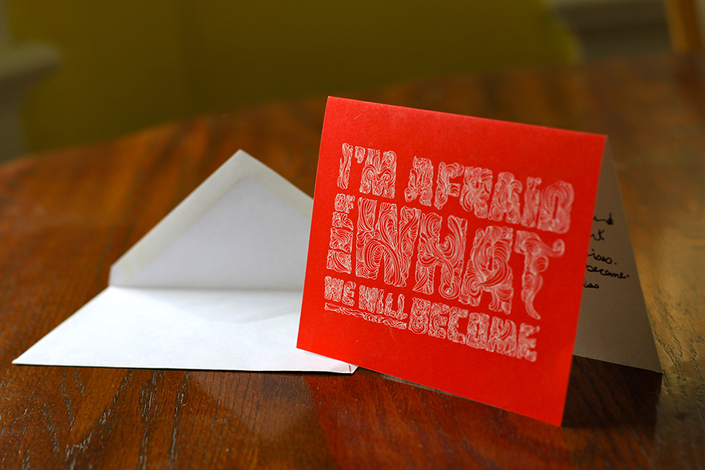
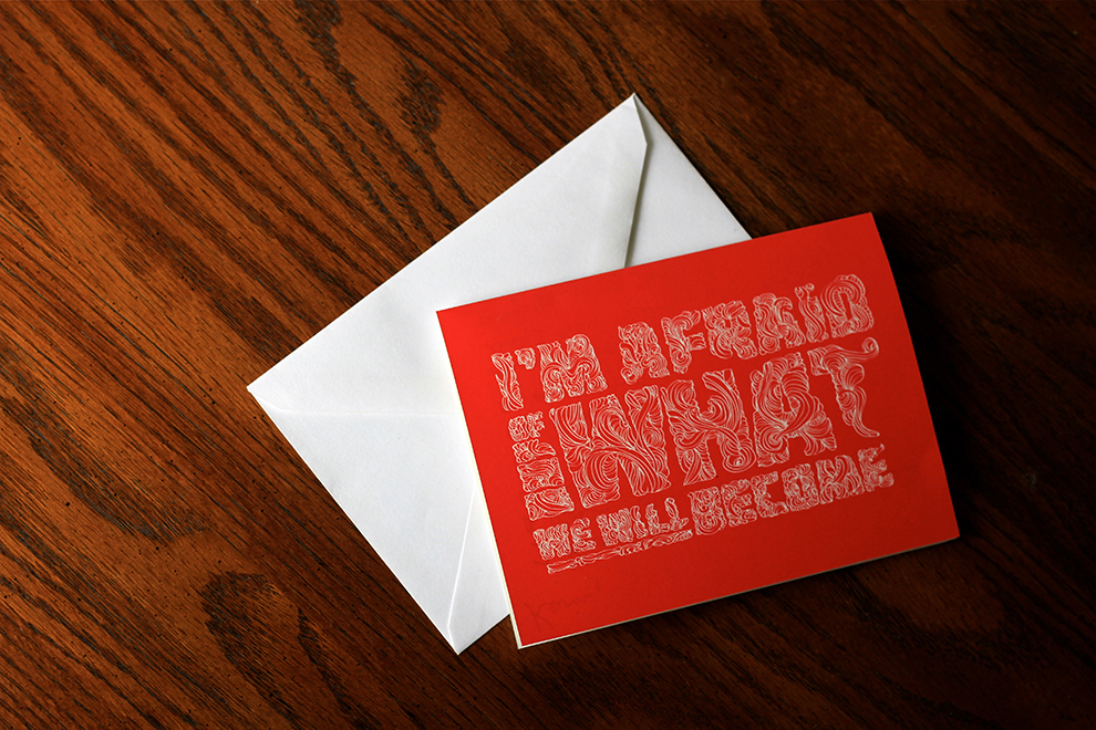
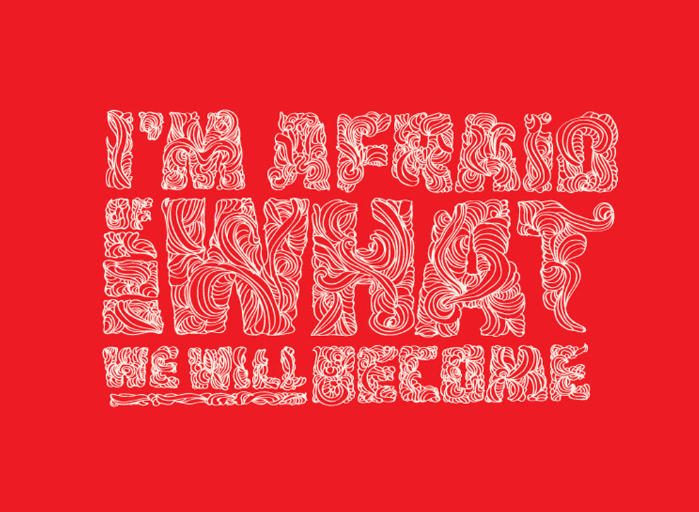
All to often in this world, when we pick up a card, it is usually flowery, funny, or sympathetic. I felt like people wanted more than those three options to express emotion. What about fear? Or the hard times in a relationship? These moments deserve just as much validation as the good times. There is beauty in pain, and the remembrance of pain and what we learn from pain. I wanted to create a typographical layout that said just what it needed to say.
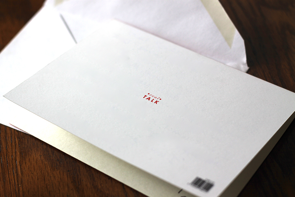
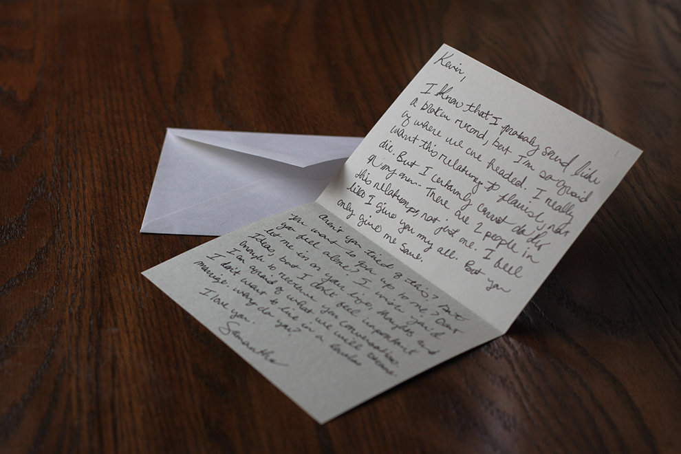
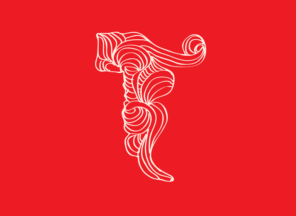
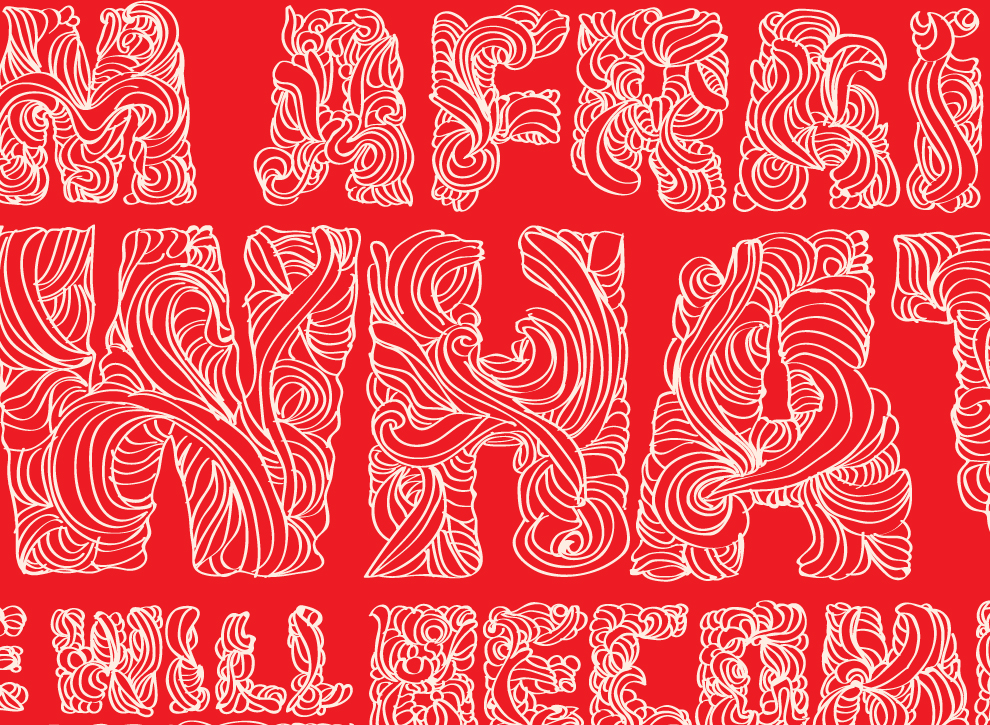
The design itself is enough to captivate someone with the intricacies of the lines intermingled with the typography. With a shocking red color, it represent that this is an issue that needs to have heavy attention paid to it. On the inside of the card, it is completely blank, because I didn’t want the words of another to effect the emotion of the person who is spilling their feeling and vulnerabilities onto paper.